EN HOMAGE TO ELIE NADELMAN
“In 1992, Tom Margittai of The Four Seasons restaurant and a director of the Distinguished Restaurants of North America, asked me to name and design an award it was cooking up to honor only the very finest dining establishments in its trade organization throughout the U.S., Canada, and Mexico. I used an acronym derived from the four words of its organization, calling it the DiRoNA, and designed a beautifully produced stainless-steel award inspired by a Picasso sculptural concept of creating a sculpture from one flat sheet of material. The shining DiRoNA Award was proudly hung by 300 recipients at the entrance to their eateries. My DiRoNA Award was a homage to my childhood ( and still ) hero Elie Nadelman: a Nadelman-like profile, sublimely munching gourmet food. Imitation is the sincerest form of flattery, and I believe that the sublime sculptor would have licked his chops at my prankish tribute.” – George Lois
The late graphic designer and art director influenced generations of designers through his iconic ‘Esquire’ covers and ad campaigns.
BY MICHAEL BIERUT FastCompany.com
While I was growing up in the 1960s, my Uncle James had a subscription to Esquire magazine. Everyone subscribed to Time and Life and Newsweek in those days, but Esquire was different. Even though I had little grasp of the bigger issues it alluded to—politics, war, racism—I was mesmerized by the power of Esquire’s covers. They were bold, poster-like, sometimes surreal, always arresting, all suggesting a knowing attitude towards a sophisticated world that I yearned to enter. It would be years before I discovered these covers were the product of one man’s imagination, George Lois.
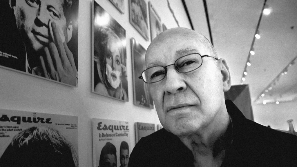
Lois, who died on Nov. 19 at age 91, was the son of a Greek florist. He was born in the Bronx and never let anyone forget it. His distinctive accent seemed, if anything, to grow more pronounced over the years. Although he cultivated the persona of an incorrigible rebel, his resume was impeccable. He moved from the High School of Music and Art, to apprenticeships under Bill Golden at CBS and Herb Lubalin at Sudler & Hennessey, and later in 1959 to the red-hot crucible of the ’60s “creative revolution” in advertising, Doyle Dane Bernbach. After only a year, Lois left to form his own agency with copywriter Julian Koenig and account guy Fred Papert. It is said to be the first ad agency with an art director as a principal.
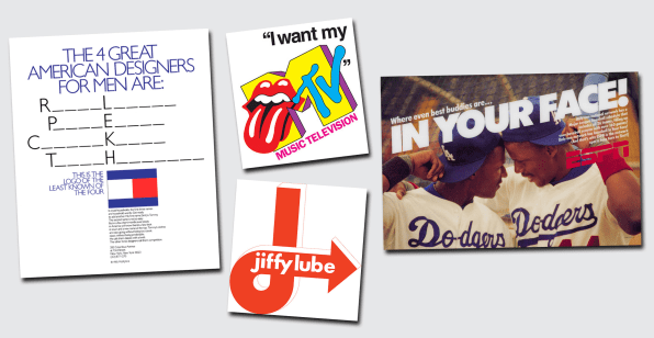
Papert Koenig Lois became the perfect proving ground for Lois’s conviction that the most powerful way to communicate in the modern age was through a synthesis of word and image, underpinned with a unifying concept that would invite the consumer to make the connective leap. This became known as the “big idea” school of advertising and would influence a whole generation of creative directors and designers. At PKL and a series of successor agencies, Lois would deploy this technique on behalf of everyone from Braniff Airlines, Seagram & Sons and Olivetti, to MTV, Tommy Hilfiger, and Jiffy Lube.
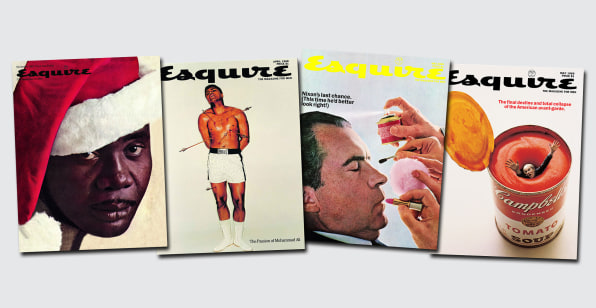
But it was Esquire that sealed his reputation. Asked in 1962 by publisher Harold Hayes for advice on how the magazine’s covers could be improved, Lois bluntly said that they needed to convey a point of view as forcefully as the magazine’s star writers, like Norman Mailer and Gay Talese. He would go on to design more than 90 covers over the next decade, charging $600 an issue and depositing the payments in a fund for Greek orphans. Together the covers create a visual record of one of the most tumultuous periods in American history.
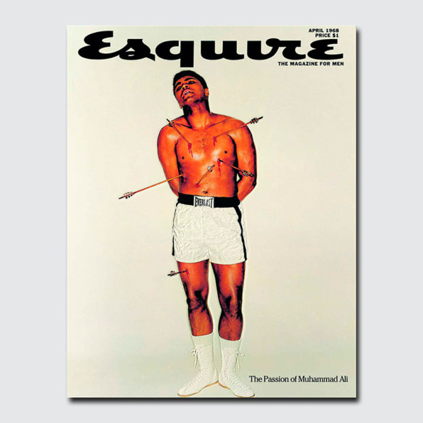
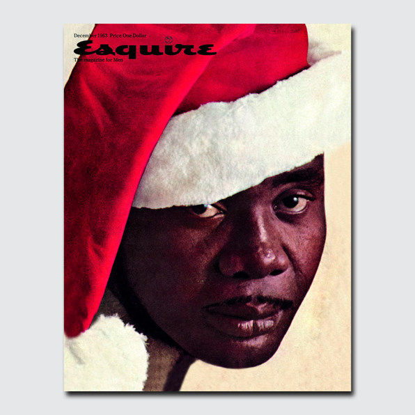
I have often wondered why these covers are so hard to imitate. Most designers I know—at least those of a certain age—can recite them like a catechism. Prizefighter Sonny Liston glowering as the first Black Santa. Mohammed Ali pierced by arrows, a modern-day Saint Sebastian. Andy Warhol drowning in a giant can of Campbell’s soup. How many visual portfolios can be described in using words alone and lose nothing in the translation?
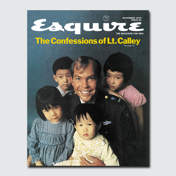
Each cover seemed to perfectly illustrate the ethos of the Big Idea. Yet at their most effective, each also concealed a tantalizing bit of ambiguity. What exactly did it mean, for instance, to see William Calley, the notorious Army officer charged with leading the 1968 My Lai massacre, smiling blithely, surrounded by a crowd of uneasy-looking Vietnamese children? That he was an innocent with nothing to hide? Or that he was oblivious to the horrifying nature of his crimes? With George Lois, the idea was big enough to accommodate defenders and critics alike.
Lois was a tireless self mythologist. His first book, George, Be Careful, a memoir published at the tender age of 41, cemented his reputation as a raconteur par excellence, with himself at the center of every story. Over the years, this tendency made enemies of former collaborators like PKL co-founder Julian Koenig and Carl Fischer, the photographer of his best Esquire covers, who accused him of stealing credit for their work. Others would vehemently dispute his claims that he had come up with the idea for New York Magazine and the logo for the Nickelodeon channel. On the other hand, he was adamant that he was in no way an inspiration for Don Draper, the slick copywriter at the heart of the womanizing, hard-drinking, chain-smoking world of Mad Men, a show he hated. Lois was disgusted that so few of the characters were shown getting excited about making ads.
That was George Lois’s big idea, in the end: that advertising was worth getting excited about, and that exciting advertising could change the world. Those meeting him late in his life would still find a fervent cheerleader for creativity. I saw him once at a book signing (he went on to publish nine books in all) and had him sign my thrift-store copy of George, Be Careful. He inscribed it with what I later learned was his standard advice: “Michael, be reckless!”